
How to create a color palette for your brand (plus five palettes you can steal!)
Choosing a color palette is one of the best ways to convey the mood of your brand and create an experience for your customers. Building a cohesive color palette can be overwhelming because there are so many directions you can go. Before choosing your color palette, it’s important to define your brand’s personality so that you can choose colors that represent it well. In this post, I’m going to walk you through the steps I follow when creating color palettes for clients.
1. Determine your brand personality
Before we get to color, it's important to identify your brand personality. To do this, you'll make a list of 8-10 keywords that describe what you want your brand to be. Ask yourself questions like, 'How do I want people to feel when they experience my brand?' and 'What words would I use to describe how I'd like my business to come across?'. After you write out your list, narrow it down to 3-5 top words that we'll use to build your color palette.
2. Pick colors that match your brand personality
Now that you've narrowed your list down to 3-5 keywords, it's time to start looking at colors that support those words. If you describe your brand as strong and luxurious, you’ll want to stay away from delicate pastels such as lavender and look for more intense, saturated colors like dark icy blues and metallics. Start a Pinterest board at this step if you don't have one already. Start collecting images that feature colors you respond to, don't filter too much at this point, we'll narrow it down in the next step.
3. Narrow it down
Usually at this point I try to step away from the project for at least a day. Give yourself some time and come back to it with fresh eyes. Go back through your Pinterest board and pull images that feature your favorite palettes. I like to choose multiple images and create a full inspiration board, but you can also choose one image to build your palette from. If you’re using Adobe InDesign, Illustrator, or Photoshop, you can open your image in one of these programs and use the eye dropper tool to sample colors directly from the image. Keep in mind you need to have a range of colors including a darker option for text, and a “pop” of color for buttons or calls-to-action.
4. Bring it all together
When I work with clients on their new brand, I like to create a brand board to visually display all the elements in one spot. Now that you have your color palette, you can create your palette board by simply drawing shapes (such as circles or squares) and filling them in with your colors. I also like to include the color codes for consistency across print and digital materials.
If you need help getting clear on your brand traits, I go through this step by step in my Brand Clarity Workbook. Download your free copy today to get super clear on your brand personality, and get even more color palettes and font combinations!

Sample Color Palettes
Below are a few examples of color palettes I have created for you to use as is, or as inspiration to build a new palette unique to you and your brand!
Palette 1 // Stability and Focus

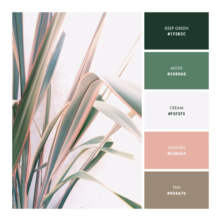
Palette 2 // Soft and Natural
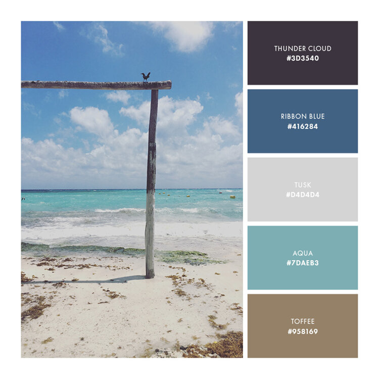
Palette 3 // Relaxing and Secure
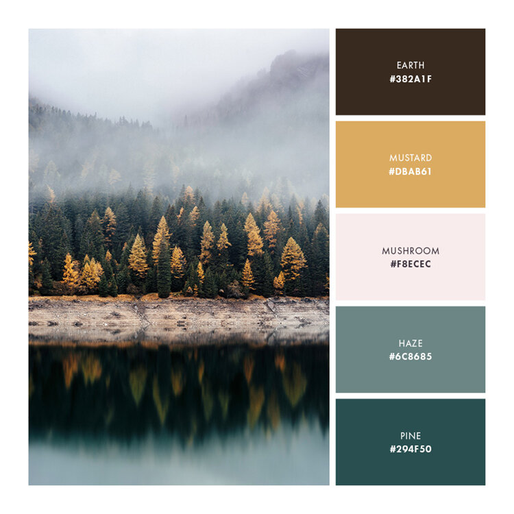
Palette 4 // Approachable and Earthy
Palette 5 // Strong and Uncompromising


