3 Logo Variations Every Brand Needs
[Updated May 3, 2024] Having multiple versions of your logo can help uplevel your brand and keep it looking consistent across all platforms and media. Having various logos makes sure your branding is flexible and you won’t have to squish or stretch your logo to fit in smaller formats. In this post I’m going over the most common logo variations. I’ll explain what they are and how to use them.
What is a logo variation?
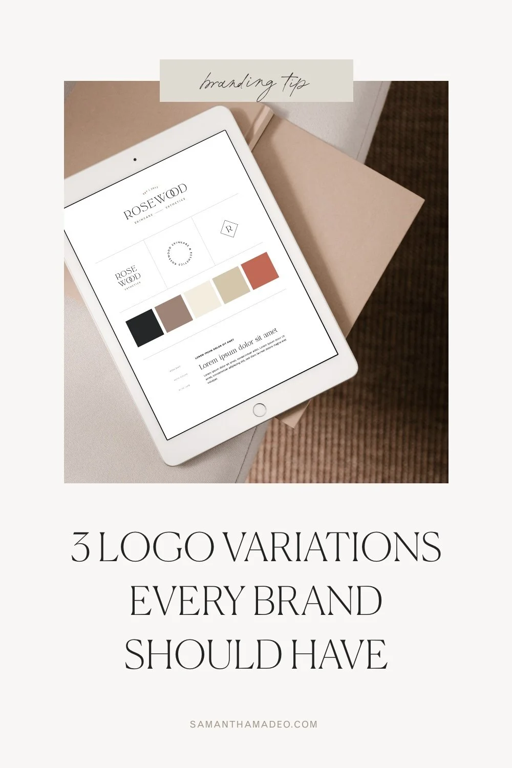
A logo variation is your primary logo rearranged into another format. The point is that your variations are still recognizable and fit within your branding, but give you options to use throughout your content and marketing materials. See below for examples of logo variations.
Why you need logo variations
It’s important to have several versions of your logo to use depending on the format and the space available. It’s important for each variation to be consistent and match with the rest of your brand identity. Here are the logo variations you should have in your brand kit and how to use each of them.

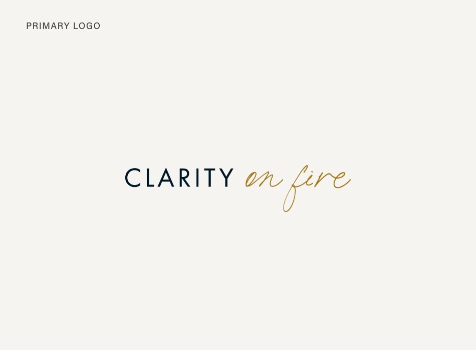
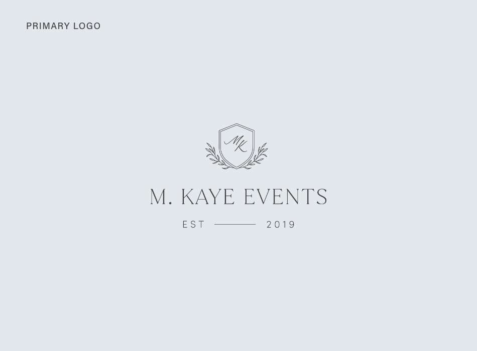
1. Primary Logo
Your primary logo is the one you’ll use most often. This is your main logo that you’ll use on your website header, business cards, marketing materials, brand collateral, etc. Your primary logo should include your full business name.

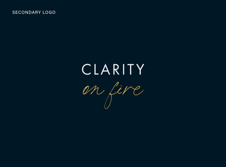
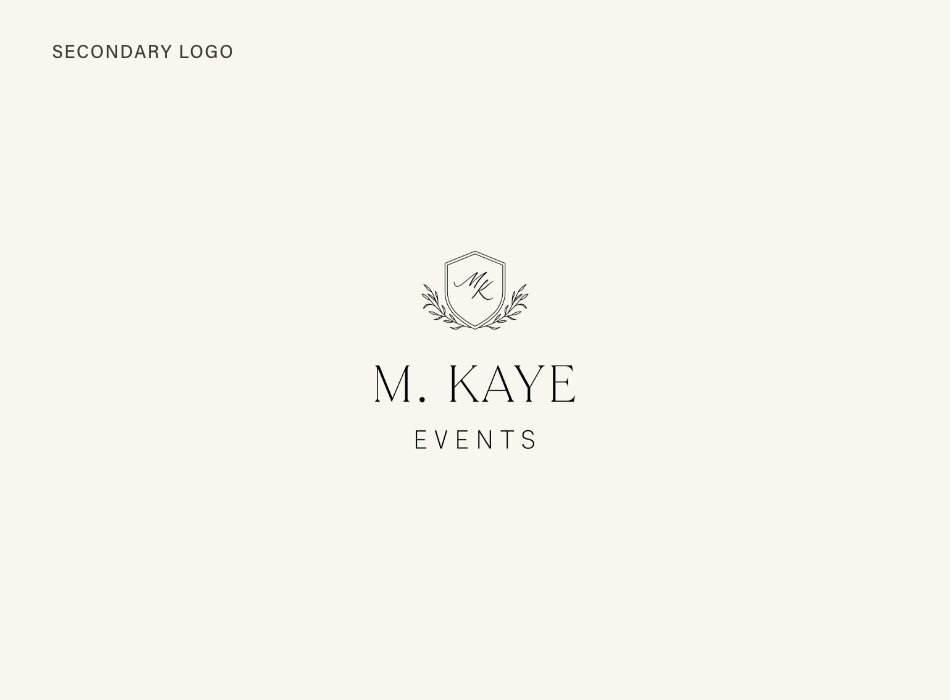
2. Secondary Logo
Your secondary logo is usually your primary logo rearranged into another orientation. So, if your primary logo is horizontal, your primary logo could be a stacked version. It’s helpful to have a secondary logo to use in places that your horizontal logo may not fit or be legible if you have to shrink it down. Some places you might use your secondary logo are social media, print materials.

3. Submark(s)
Your submark is a very simplified version of your logo—it might even be stamp-like (like the one in this example). It should include your business name, usually without the tagline.
Your submark can be used on your social media profile images, website or email footer, Pinterest and blog graphics, and podcast cover. You can also use your submark on the inner pages of things like workbooks, opt-in PDF’s, or webinar slides.
4. Icon (Bonus)
If your primary logo includes an icon, it’s useful to pull it out and use on it’s own as a brand element. Another option is to use the first letter or initials if your logo is type-based like this example.
Icons can be used to create repeating patterns, use on your website, social media, business cards or other marketing materials. An icon is a subtle way to add branding to a graphic that will already be seen in context with your full logo, for example an Instagram post or story graphic.
More Examples


See this full brand design in my portfolio here.
Ready to start designing your brand?
Before you jump right in creating various logo versions like I’ve shown here, it’s important to get clear on your brand traits and strategy for the feelings you want someone to experience with your brand. I help you with these steps in my Brand Clarity Workbook. The workbook will help you get clear on your brand strategy to create a consistent visual brand that feels on purpose.